The story
By the BestPortfolio editors ·
The first screen
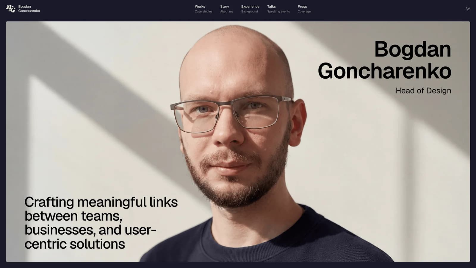
A full-width photograph on a dark navy page: Bogdan against a sunlit wall, looking straight into the camera. His name sits top right in large type with Head of Design beneath it, and the only other line is bottom left: crafting meaningful links between teams, businesses, and user-centric solutions. The navigation has five items, each with a second line saying what it is: Works, case studies; Story, about me; Experience, background; Talks, speaking events; Press, coverage.
It works because it answers the questions a visitor arrives with, who, what and at what level, before they have scrolled, and it does it with one photograph and two lines of type. The photograph does the warmth and the type does the authority, and nothing competes with either.
One scroll down is a handwritten label, Selected cases, and the work begins.
The work
Three case studies, each written to the same shape: a tag with the company and the year, the role, what was done, the audience, a TL;DR in large type beside a short context paragraph, then numbered sections, then key results. Reading one teaches you how to read the other two.
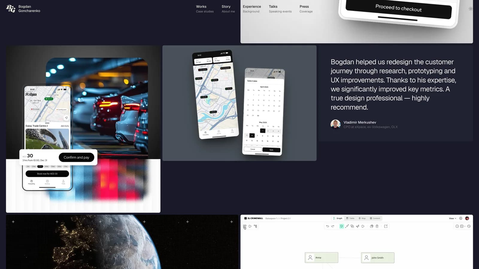
Brighty, where he is Head of Design, is the story of turning one designer shipping screens into a design function, told through the product rather than the org chart: a home screen rebuilt around the core actions, a rewards box designed as a container that scales, and a cashback programme for which he ran the research and wrote the PRD himself. The result is stated plainly: the user base doubled while he was there.
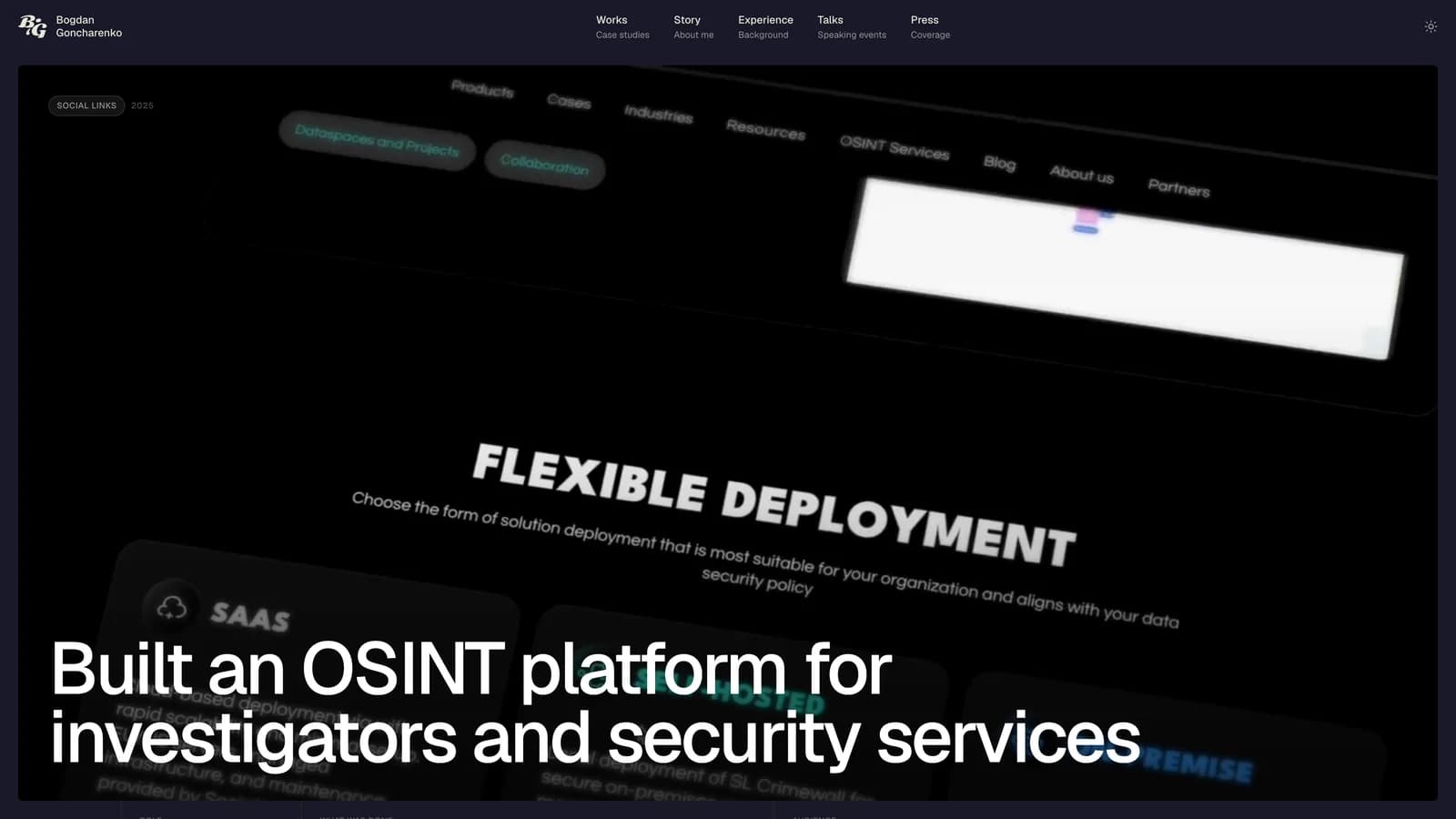
SocialLinks, where he was Head of Product Design for the CrimeWall investigation platform, is the deeper one. A product that was powerful but needed a sales call to get started, an outsourced design team, and users who would not show their faces in research. The case walks through the strategy, the hiring, the alternative feedback channels and the rebuilt information architecture, and ends with onboarding three times faster and support tickets down by a third. The BeInCrypto case, a redesign of the core reading experience of a crypto media site, completes the set.
Craft
Typography carries the site. One sans serif, set large for the statements that matter, the TL;DR, the goals, the introduction on the works page, and small and grey for the metadata around them. The handwritten labels, Selected cases, Feed, Cases, are the one decorative touch, and they are used sparingly.
The layout is rounded panels on navy. Each case on the home page is a wide card with the product shot filling it and the text in a translucent panel over the image. Below, the Feed is a masonry of product shots, photographs and testimonials, every quote with a name, a title and a face, so the praise can be checked.
The details: a theme switch in the top corner, an email address with a copy button, a numbered structure in every case study, and results given as a figure, a label and, where it matters, the number it moved from. And a round of tic-tac-toe where most portfolios would have put another call to action.
What other designers can take from it
Give every case study the same skeleton. Role, what was done, audience, TL;DR, context, numbered sections, results. Once a reader has learnt the shape from the first case, the second and third take half the effort, and the work gets read instead of skimmed.
Write the TL;DR as the thing you would say in an interview, and set it in the largest type on the page. Bogdan's are three or four sentences and they carry the whole case; the numbered sections are there for the reader who wants to check.
Put the results next to the thing they measure, with the baseline. The key results on this site are a figure and a short label, and the ones that matter most carry the number they moved from. A result without a baseline is decoration.
The month
The ten for October were chosen the way every month's will be. The editors looked at every portfolio approved in the month; the numbers, views, bookmarks and whether the badge is on the designer's own site, made the shortlist, and the sites themselves decided. Each serious candidate was opened and judged on craft and distinctiveness, whether real work is shown early, completeness, and then the month's engagement as the tiebreaker. Profession never counts.
Bogdan's site led on the first three and on the fourth as well: it was the most visited portfolio page on BestPortfolio in October, and most of that traffic came through links he sent out himself. Ten portfolios from the month are ranked on the October page. This one is the Portfolio of the Month.